Exhibition cover <ExhibitCover />
A huge title fills the left half, a light date block sits at the top right, and 3–4 columns of small text divided by thin rules run along the bottom. Designed for the biennale style; other styles work too.
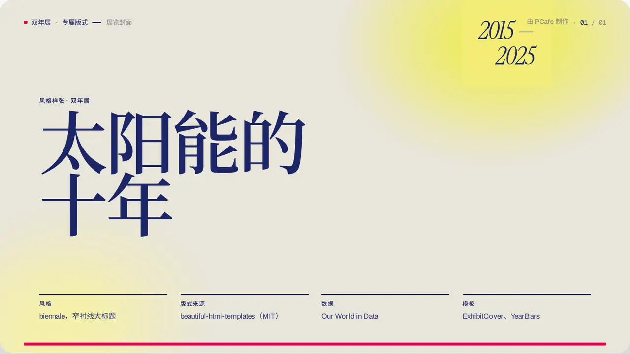
- Group
- Opening · a huge narrow serif title with a date block in the corner
- Component
ExhibitCover·#exhibit-cover
Good for
- The first slide of an exhibition, a cultural project or an annual review
- The subject is a period of time or one edition of an event
Avoid when
- You need one representative number: use Cover
- The title is longer than 3 lines
Content limits
| 1 | title 2–3 lines, ≤ 8 chars per line |
| 2 | badge 1–2 lines, ≤ 10 characters per line |
| 3 | meta 3–4 columns, value ≤ 24 chars |
Fields
| Field | Type | |
|---|---|---|
kicker · required | string | Section label |
title · required | string | string[] | Large title |
badge · required | string | string[] | Date block at the top right |
meta · required | { label, value }[] | Information columns at the bottom |
Example
<ExhibitCover
  kicker="年度回顾"
  title={['太阳能的', '十年']}
  badge={['2015 —', '2025']}
  meta={[{ label: '数据', value: 'Our World in Data' }, …]}
/>