Stepped layers <StackBars />
3–6 horizontal bars offset to the right layer by layer from top to bottom, the colour deepening from the theme colour, each with a name on the left and one line of description on the right. Designed for the broadside style; other styles work too. With build: 'reveal' the layers appear one by one.
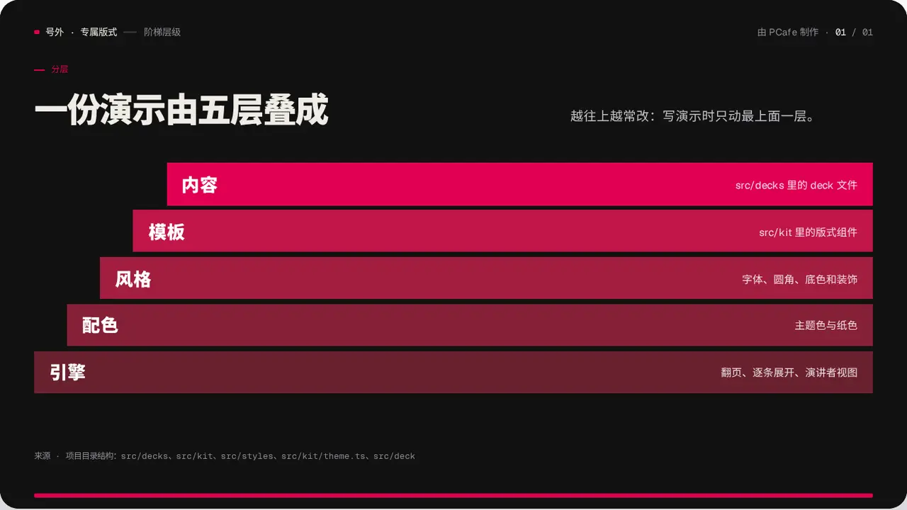
- Group
- Structure · horizontal bars offset layer by layer
- Component
StackBars·#stack-bars- Interaction
- Press → layers appear one by one
Good for
- A layered structure: a technology stack, an organisation hierarchy or priorities
- Layers that depend on the ones below
Avoid when
- The layers have a quantity relationship: use Funnel or Pyramid
- Each layer needs a detailed explanation: use LayerStack
Content limits
| 1 | layers 3–6, top to bottom |
| 2 | name ≤ 8 chars |
| 3 | note ≤ 20 chars |
| 4 | slide title ≤ 22 chars |
Fields
| Field | Type | |
|---|---|---|
kicker · required | string | Section label |
title · required | string | string[] | Title |
lead | string | Lead |
layers · required | { name, note }[] | Layers, top to bottom |
source | string | Source |
Example
<StackBars
  kicker="分层"
  title="一份演示由五层叠成"
  layers={[{ name: '内容', note: 'src/decks 里的 deck 文件' }, …]}
/>