Next-steps grid <StepGrid />
The top row holds one large accent-coloured title block and one pattern block; the bottom row holds three step blocks (time, title, description, small note), the last one in dark. Designed for the fluorescent grid style; other styles work too. With build: 'reveal' the blocks light up one by one.
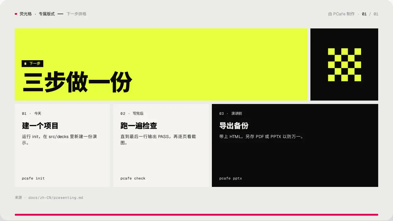
- Group
- Closing · a large title block plus three step blocks
- Component
StepGrid·#step-grid- Interaction
- Press → blocks light up one by one
Good for
- Next steps or an action plan at the end
- Three things that happen in order
Avoid when
- There are more than 3 steps: use Roadmap
- You are only summing up the points: use Closing
Content limits
| 1 | steps exactly 3 |
| 2 | when ≤ 8 chars, title ≤ 10 chars, body ≤ 40 chars, meta ≤ 16 characters |
| 3 | title ≤ 2 lines × 8 chars |
Fields
| Field | Type | |
|---|---|---|
kicker · required | string | Section label |
title · required | string | string[] | Title |
lead | string | Lead |
steps · required | { when, title, body, meta? }[] | Three steps |
source | string | Source |
Example
<StepGrid
  kicker="下一步"
  title="三步做一份"
  steps={[{ when: '今天', title: '建一个项目', body: '…', meta: 'pcafe init' }, …]}
/>