Dashboard cards <AppCards />
A row of hand-built app panels below the title: window name, title, status pill, 2–5 fields and tags, all filled in. Each card is marked as an illustrative UI. With build: 'reveal' the cards appear one by one.
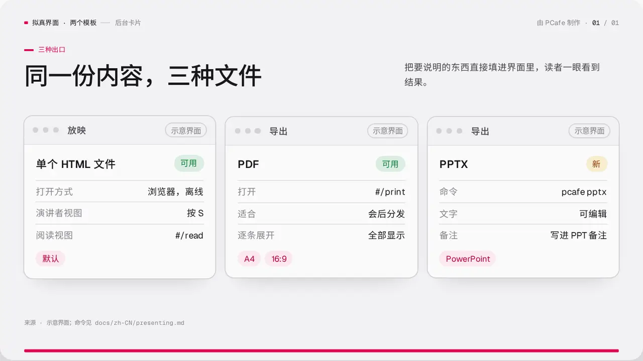
- Group
- Realistic UI · 2–4 filled-in app panels
- Component
AppCards·#app-cards
Good for
- How the same thing looks on several platforms or in several exports
- Filled-in forms instead of a text description
Avoid when
- You have real screenshots: use TabbedShot
- You need to compare numbers: use CompareTable
Content limits
| 1 | cards 2–4 |
| 2 | title ≤ 16 chars |
| 3 | fields 2–5, value ≤ 16 chars |
| 4 | tags 0–4 |
| 5 | slide title ≤ 22 chars |
| 6 | source says the UI is illustrative |
Fields
| Field | Type | |
|---|---|---|
kicker · required | string | Section label |
title · required | string | string[] | Title |
lead | string | Lead |
cards · required | { app, title, fields: { label, value }[], tags?, status?: { text, tone?: 'ok' | 'wait' | 'stop' }, label? }[] | Panels |
source | string | Source or illustration note |
Example
<AppCards
  kicker="三种出口"
  title="同一份内容,三种文件"
  cards={[{ app: '导出', title: 'PDF', fields: [{ label: '命令', value: 'build 后打印' }], status: { text: '可用' } }]}
  source="示意界面"
/>