Chat demo <ChatDemo />
Title, lead and 0–3 notes on the left; a hand-built chat window on the right, where the last reply can carry a result card. The window always carries the label 'illustrative interface'. With build: 'reveal', each press reveals one message.
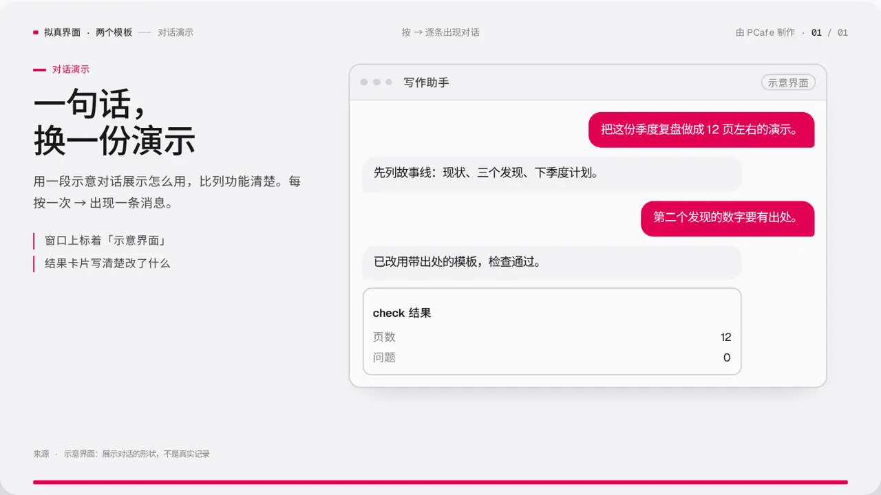
- Group
- Realistic UI · show how it works through a short conversation
- Component
ChatDemo·#chat-demo- Interaction
- Press → messages appear one by one
Good for
- A tool, an assistant or a support product: show one typical interaction
- When that is clearer than listing features
Avoid when
- You have a real screenshot: use Screenshot or TiltShot
- There are more than 5 messages: split the slide
Content limits
| 1 | title ≤ 2 lines × 10 chars |
| 2 | lead ≤ 50 chars |
| 3 | messages 2–5, each ≤ 40 chars |
| 4 | card 2–4 rows |
| 5 | notes 0–3, each ≤ 20 chars |
| 6 | app does not use a real brand name unless it is your own product |
| 7 | source states that it is illustrative |
Fields
| Field | Type | |
|---|---|---|
kicker · required | string | Section label |
title · required | string | string[] | Title |
lead | string | Lead |
app · required | string | Window name |
messages · required | { from: 'user' | 'bot', text, card?: { title, rows: [label, value][] } }[] | Conversation |
notes | string[] | Notes |
label | string | Window label, default 'illustrative interface' |
source | string | Source or illustration note |
Example
<ChatDemo
  kicker="对话演示"
  title={['一句话,', '换一份演示']}
  app="写作助手"
  messages={[{ from: 'user', text: '…' }, { from: 'bot', text: '…', card: { title: 'check 结果', rows: [['问题', '0']] } }]}
  source="示意界面"
/>